The Spring-Summer 2015 collection at Balmain played with stripes in varying thicknesses. At times bold stripes were used to emphasise square silhouettes or lengthen the line of jackets, while at other times thinner lines were woven in leather or crisscrossed to form grids in knitwear.
Some of the most interesting effects were created where the bold opaque stripes were contrasted with gaps and sheer panels to create graphic peepholes. These sheer sections also often made parts of the garments appear suspended or were used to create different framing effects on parts of the body. In one garment the bold horizontal stripe of an off-the-shoulder top floated across the front of the body without any sheer fabric for support but was supported through the zip panel at the centre back.
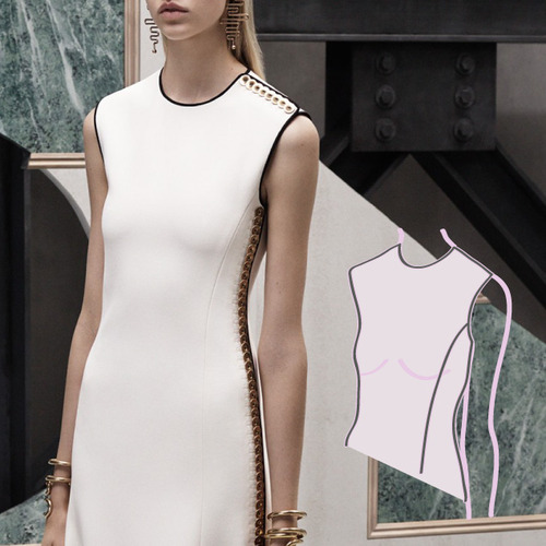
The bold stripe of the signature lapel detail of the collection, shown in the image below, was also cleverly simple in terms of construction since the detail appears to be created by bagged out rectangles that have been seamed into the outside edge of the lapel shape.
Garments from “Void” by Charlotte Ham’s label I C E.
There are times when traditional clothing materials simply will not support your design in the way that you would like. No matter what fabric, interfacing or internal structure you experiment with, there will be times when you will need to look away from the haberdashery department to find the materials most suited to your design. In the case of the collection “Void” by designer Charlotte Ham, wood worked as a construction device to support the areas of negative space in the garments, but the material also tied into the collection’s conceptual links to architecture.
Through her years of studying and design research, Ham explains that a lot of her inspiration has come from architecture and that this area has a particular personal resonance with her since she has grown up around a family building business in Somerset. Rather than just being inspired by merely the aesthetics of architecture, her interest also stems from the meanings and concepts of the discipline of architecture itself, including the concept of negative space or “voids” which were explored in her MA collection.
Ham explains that “Voids placed in architecture are essentially the construction of an empty space between solid structures such as walls. Empty space within architecture is often forgotten about but in fact it is one of the most important aspects of the final design. How the body feels inside a void can be adapted by the change in angles in walls, heights and level changes of floors and ceilings as well as the interaction with natural and reflected light.”
To achieve the rigid look that Ham desired to create the borders of the voids, fabrics were chosen that would hold their shape, but weren’t so heavy that they would “flop” or drag down the open spaces of the garments. These fabric choices were complemented with heavy interfacings, and were often supported with strips of lightweight veneer. At times the use of the veneer is hidden, with strips encased in fabric creating the internal frames on some garments. In other pieces the veneer is visible, with specially crafted corner pieces and smooth circular binding simultaneously echoing the craftsmanship of both well made clothing, and meticulously worked joinery.
To create the materials for the collection, Charlotte Ham collaborated with the building contractor HHP Ltd and also worked with the textile designers Cherica Haye» and Elizabeth Ashdown».
While it is not always suitable to use wood, plastics, rubbers or other materials in certain garments, you should always consider how your designs will be viewed and consider whether they will ultimately be manufactured and worn.
If you are making everyday clothing or high-end ready-to-wear garments, then you may still be able to introduce unusual materials as long as it is done in such a way that the materials can be removed so that the garment can be laundered or dry cleaned. For example, you could consider unusual collars, belts or elements that can detached from the rest of the material.
However, if you are creating conceptual garments for the purpose of exhibition, or couture garments, or as catwalk “show pieces” that will never go into production, then there is not really any need to be limited to traditional fabrics and trims when you are creating your collection.
Charlotte Ham is currently based in London and is building her women’s wear label I C E. You can view more images from the collection on NJAL»
Sometimes it’s interesting to think backwards from where a designer ended up and take the time to consider what the very original seed of an idea may have been. Thinking in this way can help you to see how a single idea can be developed into an entire collection. In the case of Junya Watanabe, you could imagine that the Spring-Summer 2015 collection all started with a single circle.
Once you have the kernel of an idea, sometimes you will get more out of it if you don’t simply settle for this original concept. Sometimes you can push it in an array of different tangents before you edit out the genius from the mistakes, and finally refine the idea down into a series of stages that can be revealed over the course of a catwalk show.
Using Junya Watanabe as a hypothetical example of this process, you can imagine that after starting with the original idea of a “circle” this initial thought could be pushed past a mere polka dot textile by considering:
Layering circles.
Intersecting circles like a venn diagram.
Using the intersecting sections of the circles to introduce contrast fabrics or colours… or deleting these sections all together.
Introducing a square shape to the experiments.
Allowing the separated shapes to float away from each other.
Using a sheer fabric to support these shapes as they swim off the body.
Splicing into the shapes so that they can be linked.
Using shapes of the same small scale repeated to create regular and irregular patterns.
Use larger versions of the shapes to create sleeves, pockets and overlays off the side of garments.
Reduce the 3D experiments down into 2D textiles.
Many of these ideas could even start as explorations in coloured paper or on a computer screen before you even begin to apply them to garments. Of course, depending on what your own concept is you may need to ask yourself very different questions. The fact that we started with a circle in this case means that the questions were mainly visual and based around the principles of design, however if you took a different idea such as “masculine” then your questions may be purely theoretical to begin with.
You may hear fashion design tutors criticise work by saying it is not “pushed far enough” and, in a way, this list is an example of a technique to help you to “push” an idea away from what’s been done before so that you avoid concepts and garments that are too samey and derivative.
Once you have pushed and explored your original kernel of an idea then you may find that you’ve reached a much more interesting and unique starting point from which to begin actually designing in terms of silhouette, colour, fabric and texture.
The Autumn-Winter 2015 pre-collection at McQ featured unusual prints and textile treatments, with trapped feathers and geometric hardware.
The prints seem reminiscent of many of the marbled details which keep popping up online, usually seen in an interior design context, and even the graphic shape of the belt buckles seemed to be an echo of the sort of hardware which you might see on objects of contemporary industrial design.
While the marbled blue and white fabric seems to have been printed before the garments were cut and sewn, the textured black and white print looks as though it may have been applied to a finished garment. The telltale sign of this process is where you can see white sections of fabric. These sections of fabric may have escaped being printed if we assume that these areas were crumpled before the screen was placed on top to flatten out the fabric.
If you were looking at using techniques like this for yourself you could screen print parts of the garment in stages if needed. For example, you could sew a garment to a point and then screen print the fabric to get certain effects, and then complete the construction of the garment using plain contrasting fabrics or meterage of fabric printed with the same design. This would give you greater control over the effects that you could achieve for show pieces, although of course would probably be too time intensive for garments designed for mass manufacture.
Feathers also appeared in a couple of different variations throughout the collection. They were predominantly used on the shoes to create a shaggy effect, which at times helped to emphasise a triangular and bottom heavy silhouette when viewed in the context of the complete look. Feathers were also used in one dress trapped underneath a layer of tulle, which almost makes the fabric read as a print when viewed from afar.
The Autumn-Winter 2015 pre-collection at Alexander Wang included unusual button positions, spiralling zippers and fabrics with subtle peepholes and gathers.
A couple of the garments used panels of contrasting fabrics with subtle sheer ribbing effects and slight gathering, which appeared to be caused by a loose shirring technique. Other striped garments, which appeared to be knitwear pieces, were caught in such a way that the gaps between the stripes created narrow peepholes all over the garment.
A couple of the classic tailoring pieces were given a twist at the back where the back patterns appeared to be cut to echo the curved crotch shape that you would normally see on the pattern for trousers. The back pockets used on the back of the garments were also styled to make the garment look like the back of trousers as the pockets had a double welt and button detail which is usually seen on the back of tailored trousers.
NIHL by Neil Grotzinger, Graduate Collection, SS14.
In his graduate collection for Spring-Summer 2014, artist and designer Neil Grotzinger created textiles that had an unconstrained and spontaneous quality with placement prints that appeared to be dripping with paint and beaded lines creeping across dresses like iron filings on a magnet.
The organic quality of the textiles and the scattered effect of the embellishments seem to be the direct result of Grotzinger’s focus on creating pieces that are specifically made to be unique. In fact, the more unique and inimitable the textile the better, as he sets out to create pieces that are almost more like individual pieces of wearable art.
Having “uniqueness” as a motivating factor allows the embellishment to be more complex and more spontaneous than it perhaps would have been had it been designed specifically for a ready-to-wear collection; essentially giving Grotzinger’s work a perspective more similar to a couture collection.
Aside from the textile treatments, the idea of the wearable artwork also seems to play into the shapes of the garments with screen printed or embellished areas occasionally “framed” with a plain white, black or grey surround. Some of the beaded embellishment also seems to hint at Grotzinger’s background in painting, although the medium of beading perhaps allows the colours and textures of a painting to become 3D and have movement with the wearer’s body in a way which painting alone could not quite achieve.
NIHL is the name of the label created by artist and designer Neil Grotzinger.
"Scale", as a principle of design, can provide designers with a never ending treasure trove of options when it is used to iterate a single idea into a myriad of different variations. For the KTZ men’s collection for Autumn-Winter 2015, the experiments with scale seemed to have very specific conceptual links to A Clockwork Orange, which was the inspiration behind the collection.
While some garments in the collection featured pixelated faces on appliquéd patches, these faces soon loomed closer to the viewer, seemingly in a menacing reference to The Ludovico Technique from the book and film. In this way the coloured fabric of the later looks becomes more subversive, with garments having both a superficial Rubik’s cube playfulness and a darker undertone for the diehard fans.
At times the overblown pixelated effect seemed to be created by individually positioned squares in a furry fabric, however the corners of some of these squares appeared to be joined, perhaps to help with positioning and spacing of the pieces. At other times, the squares appeared to be tiles, like flat plastic sequins with holes in each corner so that they could be sewn onto the fabric.
Aside from the pixelated images (including what appears to be a bust of Beethoven), other details in the collection were also scaled up. Large oversized zips cut through the front of what appears to be black rubber boiler suits and oversized grommets punctuated the edges of coats.
There were also some interesting pocket details to note with tilted pockets cut so that the lines of the fabric remained vertical, and tailored pockets cut with contrasting jets.
For the Autumn-Winter 2015 pre-collection at Balenciaga, many of the designs seemed to be engineered around the fastening details, with patterns cut in proportion to giant buttons and snap fastenings doubling up as embellishment.
Many of the large buttons were metallic, and these were often used to punctuate monochrome looks. Many of the buttons were also covered buttons, and these were often paired with bound buttonholes. This helps to create a seamless colour effect since you are able to use self fabric to cover the buttons, and to create the welts on the bound buttons as well.
Another interesting detail to note was the stripes of contrast colour on a couple of the tailored pieces. These seem as though they may have been created by felting a section of the garment, (afterall, we’ve seen creative director Alexander Wang use felting in the past»), or possibly this effect was created with a thick smear of pearlescent screen printing pigment.
Update: It appears that this striped effect is actually a special use of jacquard weaving techniques. While many fabrics that are commonly referred to as “jacquard” have a repetitive pattern, it appears that in this case the jacquard technique has been used to simply create single stripes during the weaving process, and it appears that a yarn with a definite sheen has been used to contrast against the dominant matt and camel-coloured yarn.
Sometimes a design that is very simple on paper can throw some surprisingly tricky pattern considerations at you. There was one particularly simple dress from the Balenciaga pre-collection that illustrates a possible solution to an important question: When you move a seam line away from an apex of the body, what are your pattern options to keep the same fit value?
In this case, since we’re using the Balenciaga dress as our example, we’re concentrating on the bust shaping so the “apex” we’re talking about is the “bust point”. You can imagine that this pattern could have been very simple if the bust shaping had been created with a fairly standard “Princess Line”, so that the panel ran from the armhole, over the bust point and down through the waist. However, the seam line actually runs off to the side of the bust, which means that some of the fit value may have been absorbed somewhere else.
Sometimes you will see a style line moved to the side of the bust like this, but there will still be a small dart, sometimes referred to as a “Dior Dart” which is used to absorb that small bit of extra shaping that is still needed to smooth the fabric towards the bust point. This fit value could also be displayed in some other sort of visible detail, such as a few small tucks, or a small amount of gathering.
With a dress this simple, the dart, gather and tuck options would be quite distracting, so another solution could have been that the excess fabric in the centre panel could be carefully shrunk and eased smoothly into the side panels. This would be a difficult feat and you’d have to have particularly forgiving fabric…
Using the Bias Grain
The other option is to reconsider one of the structural elements at the heart of the pattern: the grain line. Given how smoothly the dress hangs to the curves of the model it appears that the dress may have been cut entirely on the bias grain. This appears to be confirmed in the review on Style.com» where this dress is described by Nicole Phelps as one of “a pair of sleeveless bias-cut dresses”.
If you’re struggling with some small pattern detail like this, then sometimes it’s not about trying to rework an existing pattern, but to think more about what you need from the fabric. In this situation, creating the whole dress on a bias grain may have given the designer just enough extra fluidity in the fabric to flow easily over the curves of the body. This was probably not as simple as just redrawing the grain line on the pattern, and may have required the pattern to be re-draped from scratch.
Many typical pattern blocks are designed so that darts and seam lines are created specifically to trace over the “hills” and “valleys” of the body. In this way basic pattern blocks, and the patterns of many tight fitting garments, are designed to cling to the widest and narrowest parts of the body. Many garments are created by simply sticking to the traditional seam positions or by shifting the fit value around in fairly simple ways, such as swinging dart value into a new position around the same apex of the body.
But you don’t have to only trace over the curves of the body in this way, and sometimes by shifting the position of seam lines, and forcing yourself to deal with the fit issues this may cause, you will be forced to consider more interesting solutions.
Some designers start with their end product in mind, and experiment endlessly until they can turn their mental images into a physical form that exactly replicates their original idea. Other designers start from a point of experimentation and allow the happy accidents that occur along the way to encourage their research into new directions and evolve into new ideas and methods.
This second approach is the case for textile designer Lucy Simpson whose materials-led process has allowed her to experiment with silicone to create amazing textures.
In explaining her process while working on her MA, Lucy describes how she raided bargain stores and took “expanding foam, plastic ties, beads, sandpaper, and silicone” back to the print room and experimented with these unusual materials in conjunction with traditional textile mediums such as puff binder and aquasuede to create her own textile signatures.
The textiles that Lucy Simpson creates have a tactile quality that makes you want to reach out and touch them, or maybe even eat them, with thick ridges of silicone and candy-coloured pigments smeared across the surface of the fabric. While Lucy is staying quiet on the exact method of her textile creations, the implements that are shown alongside her textiles hint at the way everyday objects seem to be dragged through smears of different coloured pigments to create spontaneous effects. When combined with the sugary colour palette this gives the textiles that edible quality, like thick frosting or icing piled roughly on top of a cake. As Lucy points out, these types of methods are increasingly being used by textiles designers to create textiles that look quite technical but which are often created using very low-tech methods.
Lucy’s methods are tied firmly into her beliefs that both designers and consumers alike are having similar cravings; after all our daily interactions with flat digital objects, sometimes the innovations that surprise us, or the most exciting ways to work as a creative, are based on us wanting to be more hands-on and 3D.
In looking at the textiles themselves it is interesting to look at how the raised shapes of the silicone interact with their base cloths. For example, the ridges in the silicone are sometimes used to play off the direction of the ridges in corduroy. The silicone is also used to interact with stretch fabrics in interesting ways, with the stretch fabric creating a slightly bubbled effect where it is restricted by the print and cannot shrink back to normal.
As a note on presenting your designs, it is also interesting to see how the photographs of the implements themselves creates a nice insight into the process of the textiles. This also makes the textiles themselves more engaging to look at since as a viewer you can guess at how textures were created, or wonder how some of the half formed experiments evolved into other designs.
See more of Lucy’s work on her website: Lucy Simpson»
From a construction point of view, there are a number of beautiful and clever details that have been used for the Spring-Summer 2015 haute couture collection at Christian Dior. One of the most striking details is one of the textile embellishments where rows of ribbon have been sewn to a base fabric to form pleated skirts and to create bouncy silhouettes.
The process of creating these amazing textiles has been captured as part of a video following the construction of a single dress from the collection. The video by Visionaire and Refinery29 is embedded below or can be viewed at Refinery29»
While videos like this are very insightful for those who have studied fashion or work in the fashion industry, there are a number of details that may need some additional explanation to help you truly appreciate how much work and planning has gone into these garments. For this reason, we’ve taken some screenshots from the video to explain some of the construction stages in more detail.
Testing the Design and Construction Methods
Some of the early images in the video show mannequins that contain versions of the dresses in pure white. It seems likely that these are toiles», which are essentially prototype versions of the designs. As a student, young fashion designer or home sewer, you would usually sew toiles in cheaper and plainer fabrics to allow you to iterate a few times on the shape and style of the design before committing to a final pattern shape. However, some designs require the toiles to be created in the exact same fabric as the final garment, where this is financially possible, in order to create the best possible indication of whether or not the design will work.
In the case of the Dior pleated dresses, it appears that the toiles may have been created in the exact same fabric and trims, but only in white. This allows changes to the fit and silhouette to be made without the distraction of colour.
Preparing the Ribbons and Threads
The next stage that is shown in the video is the preparation of the ribbons that are to be used on the final fabric. In this section of the video, we can see that there are discussions about using certain colour numbers, and can also see the ribbons being dipped into dyes of different colours. The slight rib on the ribbon seems to indicate that they are grosgrain ribbons, which are more rigid than usual ribbons and may be less susceptible to puckering when topstitched. Threads are also selected to match these colours so that they can be used to topstitch the ribbons into position on the base fabric.
Preparing Base Fabric for Pleating
Once the ribbons are dyed (and probably checked to ensure they are colour fast) we can see how the workers in the atelier use sewing machines to attach the ribbons onto the base fabric. The coloured samples that are shown hanging in the background show how narrower samples of these panels have been used to plan out the colour order and spacing of the rows.
While we expect haute couture to be sewn entirely by hand, there may be construction reasons behind the use of the sewing machines for this task. Since the dress designs conceptually rely on absolute repetition across the perfect pleats, the use of sewing machines may simply be the most precise way of ensuring consistent size and tension across the many rows.
Pleating the Fabric
With an insight into the world of hand pleating, we then see how the fabric is carefully prepped for pleating by laying the panels between two pieces of cardboard called “pleater’s boards”. The pleats are finished by winding the mould up tight and placing it in a large steamer, where the heat and pressure will set the shape of the pleats.
We are assuming that the base fabric that is used is synthetic since synthetic fabrics have the thermoplastic qualities required to ensure that the pleats remain permanently fixed in the fabric. Pleats created in fabrics with natural fibres have different qualities and tend to be less resilient over time.
Constructing the Garments
At this point in the video, we get only some hints about the construction methods that are used to finalise the dress. One part of the video appears to show the finished pleating being gathered together, which we assume is used to ensure that each section of the panel is the correct length before it is joined to other panels to create specially blended tiers. One image shows a sketch that indicates how the different panels are pieced together, and we can see how the number of panels for each tier increases towards the bottom of the dress.
Once we look closely at the finished garments you can see a couple of examples of the barely visible easing that occurs between the tiers to slowly increase the fabric volume and create subtle variations in silhouette. In general, the pleats are often tightly gathered or folded at the top or waist of the garment and then the pleats release as the volume builds towards the hem.
The position on the garment of where the silhouette changes shape is controlled by how much one tier grows in volume in comparison to the previous row, and is also shaped from underneath by the underskirts required to support the silhouette. For the tiers to grow in volume, often two pleats are carefully tucked underneath one pleat so that the pleats slowly branch out towards the hem.
There are lots of attachments for domestic sewing machines that can help you create clever effects, but often these attachments are dismissed because of the less than inspiring examples used to show what they are capable of. In the Alexander Wang Autumn-Winter 2015 collection, many of the garments were outlined with a beaded trim, which is an easy effect to achieve on a domestic machine with a beading or couching foot.
Different sewing machine manufacturers may call these feet different things, but often you are looking for a foot that has a very large open space or groove on the underside, allowing room for a thick cord, or string of beads to flow through as you sew. Essentially once you have this foot on your machine you will need to select a version of a zigzag stitch, and as you sew over your chosen trim, the zigzag stitch will crisscross over the top of the trim, catching the trim in position.
In this video below by Heirloom Creations» you can see how the technique is used to apply a string of pearls to the edge of fabric and how the technique can be used to apply the beads on top of the fabric as well. You’ll have to test out different threads to suit your garment, for example in the video clear thread has been used so that it disappears. You may also need to purchase some different size presser feet attachments depending on the type of trim that you are applying.
You may also need to experiment with different stitch types and thread tension to get the best result. In this video below the zigzag does an extra couple of stitches each time it catches the fabric to ensure the trim is really secure.
In the Alexander Wang show, the beaded trim was used to accentuate the shape of many details and often gave definition to looks that were otherwise completely created in black. For some of the garments the beaded effect was also combined with a wavy quilting pattern and this wavy pattern also carried through to the use of beading on some of the knitwear pieces. The way that the beading looks on the knit pieces implies that a different method was used to attach the beading for these garments since the beads often look embedded in the knit structure, rather than simply being applied on top of the fabric.
Another interesting point to notice is how the loophole effect in the knitwear of this collection builds upon a technique that was developed for use in the Alexander Wang Pre Fall collection as you can see in the earlier post Textile and Pattern Details at Alexander Wang» but this time the knitwear is more tonal and subtle with the focus placed on the strings of beads.
The Delpozo collections often use clever pattern cutting details to create sculptural details or to support the silhouettes of the garments. In the Autumn-Winter 2015 collection some of the pattern making details worth noticing include sleeves that grow from panels or out of darts, and a sleeve that appears to be a variation on a raglan sleeve.
A very rough idea of the pattern shape of the raglan variation is included below, based on a theory of how the sleeve could be cut in a single piece to create a flared hem. This basic pattern shape relies on the darts and seams along the shoulder line to shape the fabric to the body.
Aside from the clever pattern details, there were also some nice uses of appliqué in vibrant colours and a few garments created in chunky knitwear. The more organic forms of the knitwear and appliqué add a nice textural counterpoint to the crispness of the tailored garments.
Although bar tacks are mostly used to reinforce sections of a garment, they can also be used to secure fabric in just a couple of places. In the Fendi Autumn-Winter 2015 collection bar tacks were used to hold blocky leather panels in position so that they hung around the models hips. These bar tacks allowed the panels to appear suspended with minimal interference to the surface of the material.
The technique of using bar tacks to secure the panels worked particularly well in this case since by its very nature leather has enough stability to support its own weight with only a few anchor points. Had the fabric been more fluid, this would have produced a different effect entirely with the fabric draping between the anchor points.
The placement of the bar tacks is critical in order to ensure that the panels hang correctly. When viewed from the front, the leather side panels appear to be fixed to short, square panels that hang from the waistband. These short panels seem to hang freely from the waistband, which may allow the front and side panels to move slightly when the models walk to give the garment more movement. At the back, bar tacks appear to be applied directly to the base skirt shapes, which may help to anchor the side panels and prevent them from swinging too far.
While the leather side panels of the collection seemed to reference thick leather aprons, other utilitarian elements appeared throughout the collection in the form of straps, pockets and front “bib” sections. These elements seemed to represent pared back versions of smocks or overalls and are often seen paired with crisp white shirts. Occasionally the “bib” section was even panelled into the yoke of the shirt, creating a contrast between the leather section and the cotton body of the shirt.
The streamlined, functional details were often offset by the furry textures used throughout the collection in both the garments and the accessories. A few garments in oversized quilting also acted as a curved and puffy counterpoint to break the clean lines of the leather garments.
Aside from being used for the side panels, the stability of the leather was also used as an advantage in creating the structure around the hems of some of the coats and dresses. For example, in one dress the upper skirt section is cut out of a soft fabric to encourage the fabric to gather nicely around the waistline, but the hem panel is cut from leather. This leather panel helps to hold the silhouette of the garment, and the weight of this hem section would also help the garment to hang correctly.
In garments made up of blocky panels, issues can arise when the wearer moves since the staggered layers may swing and flap in different directions. In one garment from the Fendi collection, this movement appears to be controlled by adding weights to the hem. There is only a hint of this, but the back view of one garment seems to show rectangular weights tucked into the back corners of the garment.
Many of the garments from the Haider Ackermann Autumn-Winter 2015 show used contrast stitching to highlight the edges of seams and waistbands. This stitching had a sketchy, haphazard feel, with crisscrossing stitches created in irregular lengths. These stitches had a softening effect when used on garments that were precisely tailored, or sometimes helped to blend elements on garments that used a clash of textile patterns.
At times, the contrast stitching was also done in more regular patterns such as the running stitches that were used to outline panel lines on sleeves, or to define the edge of yokes where pleated skirts had been attached.
The sleeves themselves were also an area for pattern cutting exploration. Some of the garments were created with two-piece, set-in sleeves that had narrow panels of contrast fabric running along the top of the sleeve head, as well as running down the side seam of the garment and down the sleeve seams. These contrast panels were on both the sleeve and body sections of the garments and it is unclear whether the contrasts were cut as separate panels or if the outer layers of fabric were turned under at the edges and effectively “applied” on top of the bottom layers.
The use of contrast stitching was particularly effective on a classic shawl lapel where the stitches appeared to creep out from the inside of the garment. This jacket was also paired with trousers that were nicely trimmed with grosgrain down the outside leg in reference to the satin or grosgrain stripes typically seen on traditional tuxedo trousers. Contrast stitching was also used effectively on a white blouse, where red stitching was used to catch strips of torn white chiffon or georgette onto the shirt front to create a loose ruffled effect.
The Autumn-Winter 2015 collection at Junya Watanabe was filled with repetitive structures created with a mathematical sense of precision. While the shapes hinted at a rigorous pattern making process, the garments themselves often had a softness and a sense of bouncy movement.
Many of the fabric manipulations hinted at the sorts of patterns that would be needed to make paper lanterns and many of the structures appeared to be created with simple shapes that are ingeniously sewn together with alternating seams. Strips of fabric and circular panels appear to be used to create different slits and gaps. It is then the length and position of the slits or the spacing between the short seams, that is controlled to vary the overall shapes of the structures. Simple changes like varying the way panels are hung, altering the position of join lines or slowly increasing the width of panels, is used to further expand the reach of the concept to create more permutations.
Often it is when gravity takes hold that the fabric opens up allowing the viewer to see the spaces created in the structures. At times, it appears as though stiffening may also be used along the join lines to defy gravity and to hold the fabric away from the body. In the accompanying diagrams some of the complex structures have been imagined in both flat and expanded forms as a guess at what some of the base pattern shapes and construction methods may be.
Struggling to understand how the honeycomb and diamond principles work? It might help to view this video about honeycomb lanterns, but imagine replacing the tissue paper with fabric and with stitches instead of lines of glue.
With tweeds, stripes, animal skins and pseudo animal prints, the Autumn-Winter 2015 collection at Miu Miu was filled with clashing fabric patterns. It is through a closer look at the details that you can begin to see where the clash is intentional and where potentially messy details have been refined to avoid distracting elements.
For example, the shirt collars in the collection are often cut so that rather than meeting at centre front on the neckline, they give the face a little bit of breathing room with a small gap. This gap also creates some space for the extra large buttons that punctuate the collection. It appears that the size of this gap is not arbitrary but has been carefully created as part of the overall pattern shape so that the grain of the collars will work with the striped fabrics in the collection.
If the fabrics used for the shirt collars were not patterned then this would not be so crucial, but as it has been designed in this collection the collar pattern grain works to shape the collars so that the fabric stripes always fall horizontally or vertically as the stripes reach the collar points. If this was not considered, the stripes may have fallen at different angles.
Careful consideration has also been given to small details such as the bound buttonholes used on the coats in the collection. On one coat the welts of the buttonholes have been cut so that the fabric pattern used for the welt will match the pattern of the surrounding fabric.
Another interesting detail worth noticing is how the collars are cut when the upper collar is cut out of an animal skin. Often these collars are cut with a very narrow panel or piping around the outside edge. In situations where an animal skin may crack or weaken when folded, this appears to be a neat solution, since the narrow panel accounts for the rolled edge of the collar, rather than the animal skin needing to roll over the edge of the collar.
There are certain construction details that are complementary to each other, echoing each other stylistically to reinforce an idea. One such pairing is that of gathers and ruffles; two techniques which are essentially based on the same process but end up with different names when played out on different lengths of fabric. For the Autumn-Winter 2015 collection at Simone Rocha gathering and ruffles were used to create asymmetric details that swooped across the body. Ruffles were also used as border details to define the shapes of the garments in different ways.
The gathers and ruffles used in the collection worked well when used on checked fabric, since the rounded curves formed by the gathering contrasted nicely with the repetition of the fabric. Velvet also worked well as a fabrication with these details, since the way the gathering draws in the fabric causes light to bounce off the pile of the fabric.
An interesting detail worth noticing was the use of gathering around the tops of sleeves, which were topped with ruffles along the top of the sleeve head. It is unclear how this sleeve is constructed, but it almost appears as though the sleeve fabric was cut with a wide border along the top edge, so that the excess fabric forms a ruffled trim when gathered to form the shaping for the sleeve head. If formed in this way, then it appears as though the sleeve would then be applied on top of the armhole seam, rather than being seamed so that excess fabric turns inwards towards the body.
The proportion of these sleeves is also clever because the dropped sleeve works well to accommodate the added height of the ruffle. For example, if the sleeve seam had sat at the normal position for a set in sleeve, then the ruffle would have also been higher and potentially harder to wear.
As a designer, the way that you actually draw or illustrate your designs can be highly influential in the actual designs that you create. For his Autumn-Winter 2015 collection, Christopher Kane appears to have been highly aware of the way that drawing impacts his own garment designs and so the act of sketching, drawing and capturing the movement of the human figure became the basis for the concept behind the collection.
Apparently, the languid figures that form one of the most recognisable elements of the collection are actually drawn from a life drawing class that Kane organised for his studio team. Quoted on Vogue.co.uk, Kane describes the layered effect of the figures as “lover’s lace” as a sensual rather than sexual reference and as an expression of “togetherness”. These lace figures appear to be created by first layering coloured lace onto a sheer backing fabric, which would help to stabilise the movement of the lace. Then it appears as though the sketchy outlines may be created with black embroidery thread to create an overall outline of the figure as well as any added linework details. Once this embroidered linework is complete the outside of the figures appear to have been carefully trimmed, with the embroidered outline acting as a fray stopping device to keep the sheer fabrics from unravelling.
Aside from the“lover’s lace”, the silhouettes of the bodies also appeared on tailored garments as velvet silhouettes which appear to have been appliquéd cleanly into position. On a sheer dress, the sketchy linework was also used as glittering outlines which crisscrossed to form a haphazard pattern with glimpses of body parts.
The free flowing movement of actually putting pen to paper also seemed to be referenced through the folded bands which embellished a tailored jacket and a sheer top, as well as being echoed down into a pleated skirt. The sketchy zigzag then appeared to be straightened out to form a more graphic zigzag pattern which crossed coats and dresses.
Cristóbal Balenciaga images from the 1950s and 1960s showing sketches and final garments.
Beautiful fashion sketches are often shown as part of the romanticised process of designing a garment, but while it can be difficult to illustrate an idea on paper, it can be harder still to turn that sketch into an actual garment. One of the skills that a fashion designer must develop is the ability to translate a design from a sketch or technical drawing into a real garment while retaining the feeling of the original idea and preserving the proportions of the design.
For a start, designers often make this difficult by designing things that only look good on paper. The way that fashion sketches are drawn is often a distortion of the human figure to help to make the design more flattering and not only is the body often drawn longer and leaner in illustrations, but the silhouette of the garment is also often exaggerated to emphasise the shape of the design. Fabrics may be drawn in a way that defies gravity, shoulders may extend wider than normal or waists may be narrowed down to nothing.
To a point, this method is fine since it is a way for designers to stylise their ideas and to distill their silhouettes down to the key ingredients. However, once it comes time to turn the sketch into reality it becomes important to analyse what it is about the design that is actually interesting to ensure that these aspects can be reproduced through the pattern/drape stages, refined in the toile fittings and then accurately shown in the final design.
In the following images, you can see some sketches by Cristóbal Balenciaga that have been paired with the final garments. On the whole, you can see that the final garments that have been produced are very faithful to the original sketches. This is partly because the designs have been carefully sketched in such a way that the atelier can break each design down and then carry the key proportions and design details across to the pattern. Even in these careful sketches you can still see how there are some elements that can’t be carried through from the sketch to the garment; a waist that is drawn too narrow or a ruffle that stands out further than the lace fabric can handle.
Occasionally, you will see a behind the scenes video in a couture atelier, where the pattern maker of a particular design will be analysing the proportions of a garment. Sometimes you may also see pattern makers drawing light lines over the sketch to highlight the key horizontal and vertical lines of the garment such as the length of a sleeve, or the position of the waistline.
By breaking your own designs down in this way, you can more objectively consider whether the proportions are working on the body. You can also use this method to consider where certain parts of a garment are in relation to the body. So a garment may, for instance, have a nipped in waistline that actually falls below the natural waistline on the body.
You can also use vertical lines to objectively think about how far you need the fabric to sit away from the body in order to create the overall silhouette that you need. This also gives you a chance to consider if you have been realistic about how the fabric will drape when sewn up in the design, or if you are expecting the fabric to defy gravity. This analysis will have an impact on the internal structure and fabric choice of your design. For example, you can’t draw a ruffle that sticks out like crisp tulle but then make a garment in drapey chiffon and expect the ruffle to match your sketch.
This analysis also applies if you are making clothes for yourself. If you are choosing a commercial pattern based on a dramatic illustration then you can consider if the key proportions and elements of the design will be flattering on your own body before you even cut a toile.
Whether you are sewing for yourself, or designing professionally, analysing a design sketch in this way will also be helpful to you during the fitting stages. Since you have already analysed how you need the garment to sit on the body in order to create the correct proportions for your design, you then just need to tweak the fit to ensure that what you liked most about the sketch is still present in the final toile, and is then carried through to the final garment.